GUI Standards
Validation Strategy
GUI validation is a process aimed at ensuring the accuracy, functionality, and consistency of the graphical elements within a software application’s user interface. It involves systematically examining and verifying that the graphical components, such as buttons, menus, and screens, behave as intended and meet specified design standards. Enforcing consistency is a key aspect, ensuring that the visual elements maintain a uniform appearance and behavior across different parts of the application, contributing to a cohesive and user-friendly interface.
Effective GUI view validation is crucial for delivering a reliable and user-friendly software product, ensuring that the visual elements not only meet design specifications but also contribute to a positive and intuitive user experience. It is often an integral part of the software testing process, providing assurance that the graphical interface functions seamlessly and enhances the overall usability of the application.
Helper functions streamline and standardize validation in software development. By encapsulating validation logic, they ensure consistency, reduce redundancy, and promote code reusability. These functions simplify maintenance, enhance code readability, and contribute to a modular and scalable code structure. We plan to create and implement these helper functions to optimize the validation process in our software development practices.
Validation Items
Fields
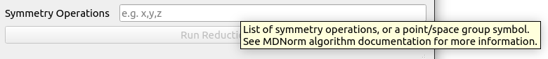
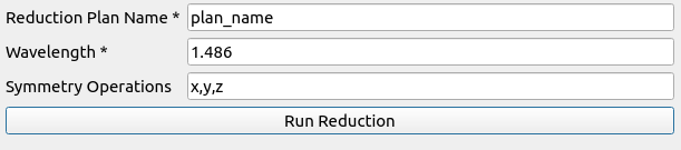
In the user interface all fields will have tooltips with brief information about the usage of the fields in the workflows. Additionally, a placeholder text with an example value can be added in fields the describe complex ideas (e.g. x,y,z). The above will guide the users seamlessly through the data input process while ensuring clarity and adherence to form submission requirements.
Optional Field with tooltip and placeholder text.
Required Fields
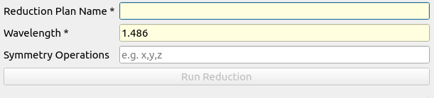
Required fields will be marked with an asterisk (*) at the end of the label. Required fields with no default values (text fields) will feature a light yellow background, serving as a widely adopted convention to visually cue users. This combination of visual indication, through both asterisks and background color enhances user experience.
Required Field with asterisk and light yellow background.

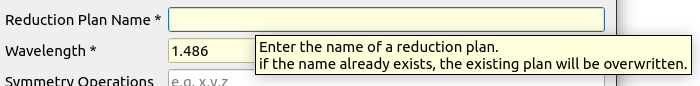
Required Field with default value and tooltip.
Buttons
In Qt applications, a best practice is to disable QPushButton, and similar objects, when associated required fields are empty or fail validation. This approach prevents users from attempting form submission with incomplete or incorrect data, promoting a more user-friendly experience by guiding them to address validation issues before proceeding. It ensures data integrity and contributes to a smoother interaction flow within the application.
Buttons should also be given meaningful names, such as “Load Experiment Plan” rather than generic names like “Load”. If multiple buttons exist in the View, it should be clear to the use which input/output fields correspond to each button. This can be achieved through grouping fields and clear labels.
Button with meaningful name and disabled state.
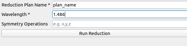
Button enabled after all fields are valid.
Field Validation
Implementing field validation with a red border for invalid entries is a visual cue that enhances user feedback in interfaces. This approach communicates validation errors immediately, aiding users in identifying and correcting input issues efficiently. The red border not only draws attention to the problematic fields but also ensures a clear and intuitive visual representation of where corrections are needed. Additionally, the status bar will dynamically change to provide hints on how to rectify the validation errors, contributing to a more user-friendly and error-tolerant design. The format of the message will follow this convention:
<field_label1> : <error_message1>
<field_label2> : <error_message2>
Types of Validation
Field Validation
Field validation, includes basic checks such as checks for minimum and maximum values or adherence to specific ranges, ensures data integrity in user input. This validation process runs as data is entered and enables buttons to become active only when the entered data meets predefined criteria.
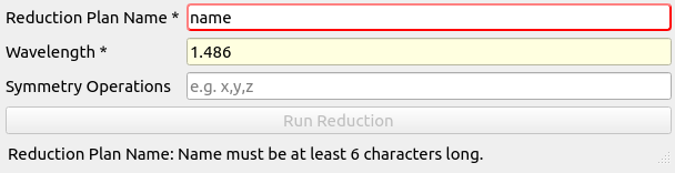
Field validation with red border and status bar message for one invalid field.
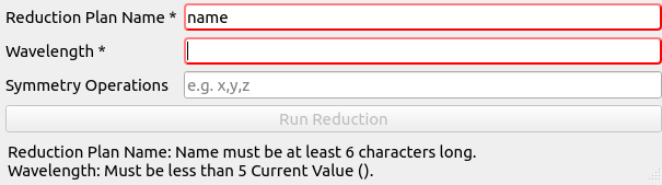
Field validation with red border and status bar message for two invalid fields.
Data Input Validation
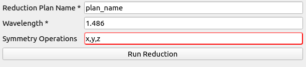
Data input validation occurs after enabling and pressing the button. This type of validation requires more complexity and can include things such as checking symmetry operations, valid file paths, and workspace existence. These inputs may include multiple criteria and require more than a cursory check to ensure they meet the underlying algorithm’s requirements. If validation fails, the execution halts, prompting the user to update the failing values before proceeding.

Data input validation will occur after the button has been enabled and pressed.
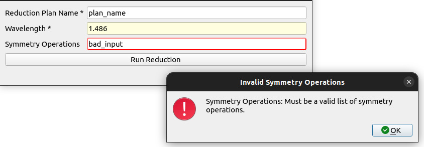
If a field fails validation after the button has been invoked, a popup will appear to notify user and the field will be marked.
After failing validation, button remains enabled and the fields that failed validation will be marked until the button is pressed again.
After pressing the button, the field will be revalidated and if valid, the field will be marked as valid and the algorith will run.
Common Validation Items
Implementing common field validations, such as minimum and maximum values, is essential for data integrity. To streamline and reduce code redundancy, helper functions will be created that are dedicated to these types of validation. These functions not only promote consistency across the codebase but also enhance maintainability, making it easier to manage and update validation rules consistently throughout the software application.
Error Handling
Error handling involves utilizing log messages exclusively within the model layer, while the view/presenter layer employs error messages, visual cues, and status messages. Log messages are employed to provide users and developers with detailed information about errors, warnings, and other relevant details for effective debugging within the model. On the other hand, the view/presenter layer uses popups to deliver clear and concise error notifications when a process concludes prematurely or with an error status. These popups guide users on how to proceed or address the issue, ensuring a comprehensive error management system. This dual approach promotes smoother application functionality and facilitates efficient issue resolution by combining detailed log information with user-friendly notifications.
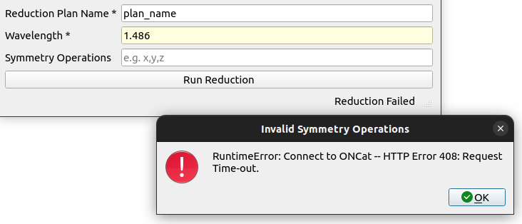
Error handling with popup explaining the error.